
Here are other ideas that were not fully fleshed out. Everything is editable.


And more font variations



Primary Idea
Secondary & Separate Idea
Focusing on the Primary Concept…
A fresh perspective on bookkeeping
Mount Ivy Bookkeeping is built around a simple idea: managing your business finances should bring confidence and peace of mind, not anxiety.
The visual identity was designed to communicate that philosophy through natural elements, approachable typography, and a calming color palette.
Rather than using traditional financial imagery such as calculators, dollar signs, or spreadsheets, the brand takes a more organic approach. The ivy represents growth, resilience, and stability, while the overall design creates a sense of order, balance, and dependability.
The result is a brand that feels professional without being intimidating, and personal without sacrificing credibility.
The meaning behind the design
1. The ivy emblem: Growth, strength, and stability
The ivy is the defining visual element of the Mount Ivy identity.
Ivy is a plant that grows steadily, establishes strong roots, and continues to thrive through changing conditions. These qualities make it a natural symbol for a bookkeeping company that wants to be a dependable partner in its clients’ business journeys.
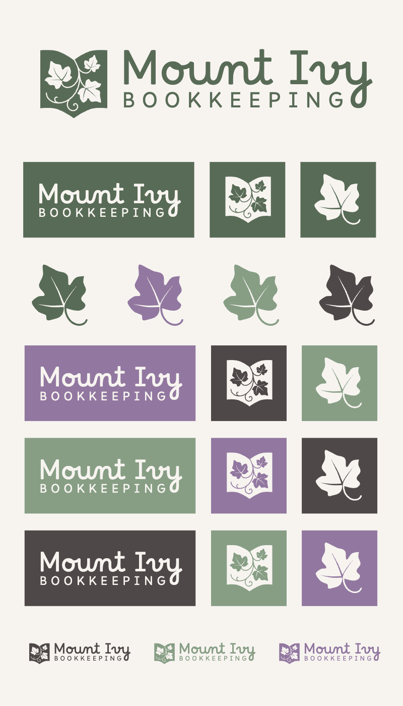
The emblem incorporates several ivy leaves within a structured, book-like shape. This creates an interesting balance between the organic and the organized.
There are a few ideas communicated through this combination:
-
Growth: Helping businesses establish healthy financial habits and build toward a stronger future.
-
Resilience: Providing consistent support as businesses navigate challenges and changes.
-
Protection: The shield-like shape suggests security, care, and the importance of protecting the integrity of financial records.
-
Organization: The contained illustration represents bringing individual pieces together into a clear, cohesive picture.
There is also something reassuring about the emblem/book. It feels established and dependable, almost like a traditional mark of trust, but with a fresh and contemporary interpretation.
2. The typography: Professional with a personal touch
The wordmark uses a distinctive, rounded typeface that gives Mount Ivy its personality.
The softer letterforms make the brand feel friendly and approachable. This is important because many business owners find bookkeeping intimidating or simply don’t enjoy dealing with it.
The typography helps remove some of that intimidation.
The larger Mount Ivy lettering establishes the brand name, while the clean, widely spaced uppercase lettering in BOOKKEEPING provides contrast and reinforces the professional nature of the service.
Together, they communicate a company that is knowledgeable and capable but also easy to talk to.
The typography strikes a nice balance: it is memorable without being overly decorative and distinctive without feeling overly formal.
3. The color palette: Calm, grounded, and trustworthy
The color palette is an important part of what makes this identity distinctive.
Deep green is the foundation of the palette. It represents trust, dependability, and stability. It also connects directly to the natural ivy inspiration.
Sage green softens the darker green and introduces a sense of balance, renewal, and calm. It keeps the brand feeling fresh and approachable.
Lavender adds an unexpected touch of personality. It brings warmth, creativity, and a little individuality to an industry that often relies on more predictable corporate colors.
Earthy brown provides contrast and grounding. It reinforces the feeling of reliability and creates a sophisticated alternative to black.
Warm cream gives the colors room to breathe, keeping the overall identity soft, welcoming, and uncluttered.
The combination is intentional. The greens establish trust, the lavender adds personality, and the brown grounds the brand in dependability.
4. A flexible identity that grows with the business
One of the strengths of this brand board is the use of multiple logo configurations and color combinations.
The identity includes:
-
A primary horizontal logo for websites, business cards, and general branding.
-
A simplified wordmark for situations where a more compact logo is needed.
-
A standalone ivy emblem that can work as a social media profile image, favicon, watermark, or other small-scale application.
-
Multiple color variations that allow the brand to adapt to different backgrounds and marketing materials.
This flexibility gives Mount Ivy a recognizable visual identity without requiring the same logo treatment everywhere.
It also allows the company to maintain a consistent appearance across its website, social media, printed materials, and client communications.
My final thoughts on this design recommendation
1. It is approachable. The rounded typography and natural illustration make bookkeeping feel less intimidating. Clients should feel comfortable asking questions and trusting someone with an important part of their business.
2. It communicates dependability. The structured emblem, deep green, and earthy brown give the identity a sense of permanence and professionalism. This is especially important when communicating accuracy and audit readiness.
3. It is distinctive. The lavender and botanical elements set Mount Ivy apart from the typical bookkeeping brand. It doesn’t look like every other financial services company, and that is a good thing.
Mount Ivy Bookkeeping is the steady, trusted partner who helps take the worry out of your numbers, so you can get back to growing your business.
Slogans/Taglines
Clear Books. Peace of Mind.
Short, confident, and immediately communicates the benefit of working with Mount Ivy.
Rooted in Accuracy. Growing with You.
The most brand-specific option. It ties the ivy illustration to the company’s purpose and creates a memorable message.
Your Books in Order. Your Mind at Ease.
The most conversational option. It speaks directly to the relief clients are looking for when they hire a bookkeeper.